· SYMBOL MARK

- · The "ㅎ" is a character in the Korean language, and it symbolizes a person with open arms.
- · The lively colors symbolize KTO's active and innovative energy.
- · The top circle symbolizes the globe, which stands for KTO's activities in promoting Korea to the world. The open arms symbolize a welcoming of Korea, and the large bottom circle symbolizes harmony and eternity.
· SYMBOL MARK_PRIMARY COLOR
This symbol of KTO plays a key role in representing and promoting the image and awareness of the corporation in
various forms of media. It is therefore important that the colors and forms comply with general CI guidelines.
There is a minimum size guideline on the symbol in consideration of reproducibility in its genuine form,
which application in principle. However, for larger size applications where printing by a computer is not practical,
the symbol should carefully follow the grid guideline shown on the left.
· SYMBOL MARK_SECONDARY COLOR
A secondary color scheme is suggested for applications requiring a variation to the original. Compliance with the CI guideline on this secondary symbol is also important for consistency. There is a minimum size guideline for the symbol when considering the reproducibility of its genuine form. Such measures should also be respected. However, for larger size applications where printing by a computer is not practical, the symbol should carefully follow the grid guideline shown on the left.
· SIGNATURE_ENGLISH

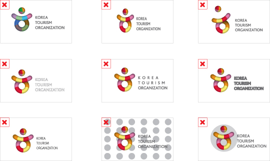
The English signature of the KTO is a key component of the organization's CI for use in all forms of media. Therefore, it is important that the combinations, colors and proportions comply with general CI guidelines. For mediums where the English signature is used as the main and supported by a Korean signature, "Signature_English 2" should be used. There is also a minimum size guideline on the English signature of KTO in consideration of their readability and reproducibility, which should also be respected. A CD-Rom should be used to download the original symbol for any application in principle. However, for larger size applications where printing by a computer is not practical, the symbol should carefully follow the grid guideline shown on the left.
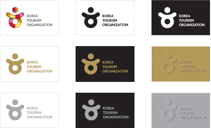
It is important that the KTO CI conform to the guidlines as they consiture an important medium that represents and promotes the image and awareness of the organization. Refer to the detailed CI guidelines of colors, which states that up to four color schemes are allowed depending on the media (newspapers, magazines etc). Particular attention should be paid to minimize variations to the gradation and brightness of the colors, by making references to the color samples. Use of Pantone Color coding or numbering is recommended.
· MAIN COLOR PALETTE

· SECONDARY COLOR PALETTE

· BACKGROUND COLOR STANDARD
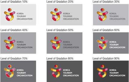
The background color standard of the KTO logo is an important part of the organization's new CI for promotion of its image and awareness, designed for effective communication per type of media. An important part of the background standard is that it allows the KTO signature to stand out clearly, based on contrasting colors and level of gradation. The most desirable combination is the use of a background. For any other variations in background, the following guideline on different combinations should be followed.
· COLOR USAGE
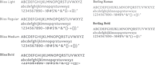
The English typeface of the KTO, both its signature and symbol, is designed with close consideration of harmony and balance in mind. This typeface should be used in all titles, captions, templates and main texts of various publications. The typeface suggested in this guideline should be applied in principle, but variations are allowed where appropriate, depending on the nature of the medium used.


